Jul 15, 2008
Posted | 14 comments
Much has been made of the NYC DoE’s “Truth Squad” push, partly because it’s pseudo-scandal, partly because it’s such a poor effort that deserves a bit of criticism. And, as much as it’s an eye-rolling bother to read 30 inappropriate references to Orwell each day, at least the Ohanians and UFTers of the world are finally overstating Orwell re: something other than George W. Bush and Rethuglican conspiracy theories [we'll likely be back to that by Thursday - if you can't wait, you can read Mr. Guhlin's The Pulse-parroting of "Reading First was unveiled as a program to make money for Bush Administration cronies"].
Actually, I’ll run with this for a second - check out the latest debate about the recently-cancelled Reading First:
- Stephen Krashen - who couldn’t help but substitute “ph” for the “f” in “failure,” as such wannabe-wit is too strong a lure for some - squeals in delight at RF’s demise. He claims that there is no literacy crisis in the USA. With apologies to Prof. Krashen and many of the fine folks at/graduates of USC, I could name a few professional athletes with USC pedigrees who could prove him wrong. Actually, I should probably go easy on Krashen, lest he write one of those letters to the editor for which he’s so famous.
- Reid Lyon, who slaps Krashen’s argument silly.
- Eduflack, whose sensible takes on Reading First and the most recent debate is always appreciated.
- Richard Whitmire, who advises that the National Reading Panel reconvenes.
And now back to the spying issue.
I was a little bit surprised that others were surprised by the DoE’s move here. Absolutely every organization, if it’s big enough, has to monitor its brand. There’s nothing wrong with engaging in public discussion on blogs - I just wish that the DoE had the courage to take the bull by the horns. If they’re discussing information on other sites, they’d do well to have their own similar information channel [which would, of course, cut down on what they'd have to monitor elsewhere].
There’s one bright point to the Truth Squad - it’s cheap compared to what the DoE would’ve spent had they not gone DIY.
You do realize this happens constantly, don’t you? Even the little guys like me deal with education-related PR representation frequently. Most are wonderful - they want to add to the information you’ve got and make sure your questions are answered.
Others, however, are rotten little things. Here’s an example with the subject of “Circulation/Hits”:
Good morning,
I was just wondering if you have any ideas about how many hits a day/month/etc. your website receives. Thanks for the help.
Little did she know how much I love to assuage wonderment!
Of course I know everything there is to know about my web activity - would you believe that 26% of my direct web traffic makes $100k a year? - but it’s the blog equivalent of one’s Social Security number. Such specific stats aren’t to be given out, especially when there’s no stated purpose.
I know the firm well [they always seem to assume that we're totally ignorant], and I know why they get hired. I responded:
XXXXX,
Thanks for the inquiry. XXXXX provides me with all sorts of statistics/analysis, and there are a few other outlets that use my content that don’t show up [with] XXXXX. I tend not to release any site information, but if you can tell me more about your request, I’d be happy to oblige - let me know.
Thanks again,
Matthew
I got a very short reply:
I work at a PR firm and we wanted to know from a media standpoint. If you cant release the information, that is ok!
Thanks,
XXXXX
“A media standpoint.” Again, they think we’re all ignorant - it’s like an e-mail from Microsoft saying, “I work at a computer place.” I don’t mind playing the e-mail game, though.
I’d be happy to assist [PR firm] in any way - [PR firm's] reputation, especially as it relates to PR for higher ed, is excellent. Since I have written things about several of your clients in the past, I’d need to know the purpose for my statistics - ‘a media standpoint’ is a bit vague. Hopefully I can provide something of value.
And that’s the truth. I love to help get messages out, and I probably don’t do it enough. But the timing of this message, and the vague nature of the communication, suggests [as it has so many other times] that this was about crisis management.
In short, I’m being asked to tell them how much they need to worry about something I’ve written. This is sensible, this vetting and prioritization on their end - but it’s awfully rude to suggest it so openly.
Imagine being at a school board meeting - and since this is so common, it shouldn’t be hard to imagine - and making a public comment. Right after that comment the Superintendent or Board President asks, “Well, how much do you pay in school taxes?”
If that number is high, they’ll take you seriously. If it’s low, you’re brushed off instantly. That thar’s some Realpolitik, says the love child of Davy Crockett and Bismarck.
This firm is only worried about the impact of truth if enough people are actually going to see it.
Hey Matt,
I was just curious about the circulation because when you do mention our clients, we like to be able to give them a ball park number of people to whom the message will be reached. Thanks!
Uh huh. Perhaps this PR firm could hire someone to teach their 12-year old interns how to: a) communicate and b) politely conceal motives.
And I might be wrong - I never discount that possibility. This firm might be chiefly concerned with only that benevolent PR and not the DoE-style fact-choking, but the tone of the communication leads me to think otherwise.
The point here is that all our big education institutions, from Depts. of Ed. to colleges/universities, are spending your money to do this anyway, whether it’s in-house [cheap, inefficient] or through an outside agency [expensive, efficient], whether it’s using tax money or alumni donations.
The best way to save these schools money is to be accurate.
Oddly enough, sometimes the best way to rack up a huge PR bill for them is to be accurate, too.
Jul 10, 2008
Posted | 1 comment

In case you haven’t heard about the NYC-DoE-KGB-CIA:
Employees at the city Department of Education‘s press office have a new assignment: They are to scour a group of 24 education Web logs, e-mail Listservs, and Web sites in a hunt for factual errors and misinformation. Department officials are calling the unit the Truth Squad.
The squad’s latest triumph should appear today on a Listserv operated by the parent organizer Leonie Haimson — in the form of an e-mail message arguing that Ms. Haimson’s characterization of summer school programs as underfunded was incorrect.
Press officers have also posted responses in the form of comments to the blogs they read.
Good God, creating this Truth department is like Alexandria’s librarian getting late fees in order while the building is burning down.
The idea here isn’t a bad one, but it really isn’t newsworthy. Nothing new here about an organization keeping tabs on its brand. Everyone does it - via LexisNexis, various online alerts, media tracking companies, etc.
The real problem is how embarrassingly inefficient this is. Really, 7 people for 24 outlets? Consider the following stats from my own RSS Reader:

1:425 is better than 7:24. Yet another example of the free market handling things far better than the bureaucracy. Somehow I don’t think the folks at the DoE will toss me an e-mail asking how they can do it all more efficiently, though they’re certainly welcome to.
A bit of self-reflection would’ve done the DoE well, too. If your organization has problems with distortions/inaccuracies in the community at large, it’s partly your own fault. Look at how to disseminate information more clearly, and at a higher effective volume - then start regulating. That too will probably go by the wayside.
And, of course, the irony gives a chuckle. When an organization implements a watch program for blogs and the like, it’s because those media are effective means of communicating - otherwise, the organization wouldn’t bother with the misinformation. One would think that a light-bulb would go off, something like:
DoE 1: “Hmm… they’re wreaking havoc on our PR. We could police them… or… we could use the same distribution channels ourselves! And do it right!”
Which would likely lead to:
DoE 2: “Ms. 1, you haven’t been with the Department very long, have you? Let’s stick with what education does best - reactionary finger-pointing and chastising, preferably without much knowledge of scholarship, fiscal responsibility, teaching… or general smarts, for that matter.”
DoE 1: “Good point.”
The DoE has chosen to monitor the symptoms and leave the disease alone. Well done, guys. Maybe the DoE could refocus its efforts to do things like:
That’s a short list of other stuff you could work on, DoE.
But you don’t have to take my word for it [hat tip on phrase: Reading Rainbow!]:
- Mr. Russo, who actually knows the identity of TWIE’s spy.
- And Flypaper, which knows its peeper, too.
- PhiBetaCons, which points to Sol Stern’s tongue-in-cheek Orwell reference.
- UFT’s Leo “Logical Garbage Plate” Casey, who references Orwell - and apparently means it.
- Eduwonkette, who could’ve done better than the Lennon quote - perhaps Johnny Cash’s “What Is Truth?”
- EdNotesOnline, who’s pithy from the get-go.
Jul 10, 2008
Posted | 1 comment
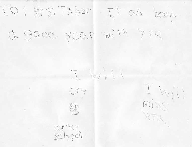
Mrs. Tabor - mother, not wife - works in a non-instructional/administrative role in a public school. As the school year wrapped up, one of the little scamps she sees regularly at the school took it upon herself to draw a little picture. It says:
To: Mrs. Tabor
It [h]as been a good year with you
I will cry :( after school
I will miss you
Golly gee, and Mrs. T isn’t even a certified teacher. How, then, is it possible for her to have reached a kid?
That’s what I want to know.
Jul 8, 2008
Posted | 6 comments
This edition of the Education for the Aughts Podcast addresses three topics:
- A look at patriotic curricula in public schools - what we had and where we’re not;
- Grade inflation in Hillsborough County, Florida;
- Lack of accountability in New Hartford, NY and a financial boondoggle in Utica, NY.
You can play this Education for the Aughts Podcast by clicking on the triangular ‘play’ button on the player below [or at the bottom of the post if you’re reading this in RSS] - it will expand and begin streaming audio. Alternatively, you can download an mp3 file of the podcast to listen in your own media player.
And, if you like what you hear, you can subscribe to Education for the Aughts Podcast using RSS or using iTunes.
[audio:http://matthewktabor.com/audio/aughts_podcast_03_arbor_fl_utica_64kbps.mp3]
… and a partial transcript with links from the podcast is below.

I listened the other day, as I do most days, to talk radio host Dennis Prager. He lamented on this Independence Day that American children just don’t sing patriotic songs anymore - and he’s quite right.
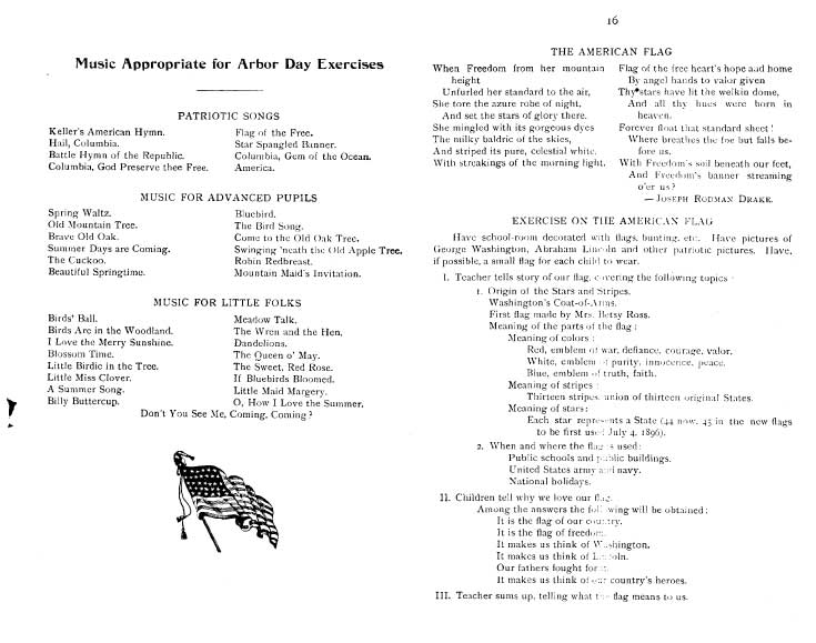
Dennis’s point reminded me of something in my historical archives - a program of instruction for Arbor Day in New York State Schools, May 8, 1896. The program is a 16-page guide from the Dept. of Public Instruction that outlines activities and themes that schools might cover on the celebration of Arbor Day.
Near the end of that program is a list of songs that school-children could sing:
Keller’s American Hymn
Flag of the Free
Hail, Columbia
Star-Spangled Banner
Battle Hymn of the Republic
Columbia, Gem of the Ocean
Columbia, God Preserve thee Free
and America
Following that, there was an “exercise on the American Flag.”
Remember, folks, this was for *Arbor Day*. That our current celebrations of American holidays pales in comparison to what we’ve done in the past for even fairly unimportant holidays, shows how much we have, to quote Virginia Slims, come a long way, baby - and that’s not always a good thing.
The inimitable Suzie Creamcheese, who blogs at The Wall, passed on yet another tidbit about Hillsborough County.
Hillsborough County, Florida - for those of us outside the state, we can just think of this as the greater-Tampa area - has a grade inflation problem. A big one.
As The Tampa Tribune opined a few weeks ago:
“It used to be that a 4.0 grade-point average was considered a perfect “A,” but the numbers posted by some recent Hillsborough high school graduates have been positively stratospheric - including the county’s top GPA of 8.68 earned by a student at King High School who was this year’s numbers leader.
Who knew there was even such a thing as being more than doubly perfect?”
Well, Tribune editors, if you hadn’t realize by now that Superintendent Elia and her administration think *they’re* doubly-perfect, now you do. See, they’re just passing on to the students the back-patting that’s given administrators in Hillsborough County a grievous case of bursitis over the last year.
Later in the piece - and it’s a must-read - we see real evidence of grade inflation from the mouths of babes:
“As one Chamberlain High School student recently put it: “In our class, anything under a 5.0 is considered mediocre to sucky.” And here we thought a 5.0 was better than perfect.
The district would provide considerable more transparency and accountability if it ceased monkeying with the labels and scoring systems and simply made high school courses appropriately hard and fair.
Schools should give extra credit to students who push themselves the extra mile, but there’s no need to pile it on so thick.”
A sensible suggestion, no doubt.
In an absolutely useless rebuttal to the Tribune’s editorial, Superintendent Mary Ellen Elia, back-patter extraordinaire and anything but a scholar, explained to we who are so intellectually deficient, why these GPAs are so high:
“The Tribune’s June 14th editorial is yet another unnecessarily harsh jab at the public schools.”
Actually, Ms. Elia, it’s a fair treatment of a glaring problem with your terrible administration. She went on to explain to we who are ignorant dolts and the like why, exactly, these GPAs are so gosh-darn high:
“There’s a simple reason the GPAs are higher: Students take more classes and more challenging classes. Good for them.”
Yes, Superintendent Elia - and since you’ve weighted those class grades so outrageously, your students wind up with GPAs that mirror Mary Lou Retton’s scores on the floor exercise.
Your system created the problem, then you tell us that we’re dumb for not realizing how the system works. If you want to know why I don’t live in this otherwise wonderful part of Florida, there ya go.
[April Griffin's endorsement of Stephen Gorham]
On a more local note, there’s a bit of news out of New Hartford, New York regarding public information requests. The blog New Hartford, NY Online, an offshoot of the New Hartford Concerned Citizens, would like to see New Hartford Central School comply with the Freedom of Information Laws - or FOIL, for short. They say:
“That’s right; it is a law, but the New Hartford Central School just doesn’t seem to think they need to comply.
We have received emails from our readers asking us when we think we might get a copy of the Employees Union Contract that was approved by the school board in January. The clock keeps ticking…”
Hopefully their clock has a fresh battery, because it may have to tick for quite some time before the district responds. One is sometimes driven to think that FOIL, to public school administrators, is just something you make hats out of in ed school.
And on Fault Lines, the Greater Utica Blog, we learned that the Utica City Schools administration is pushing a $187 million dollar bond. Says one Ms. Bernadette Eichler in the Utica O-D:
“Over the years, I have worked with brilliant, creative and caring administrators, teachers, members of the Utica Board of Education, college staff and community members.
Their wisdom, leadership, support and ideas did indeed bring the students in the Utica district to a higher level of academic achievement. These abilities and talents also created a stimulating environment for learning, as well as provide opportunities for students to explore and try new ideas.
Now this leadership and support groups of Utica have an unbelievable opportunity to once again demonstrate their wisdom and talents by supporting the $187.6 million bond issue.”
Fault Lines mashes the nail right on the head:
“Wow. These are the same people who studied a project for months that they could not carry out, shuffled administrators like they were a deck of cards, couldn’t keep student schedules straight, ran out of textbooks, and spent a ton of money at Proctor and now want to spend more at the same school.”
And to make matters worse, a commenter on Fault Lines said that the project:
“won’t cost tax payers a dime.”
To hearken the earlier Arbor Day discussion, we’d do well to remind our kids on the next Arbor Day that money, especially tax money, doesn’t grow on trees, contrary to what their schools’ administrators seem to think.
Ms. Eichler may find this bond proposal to be an “unbelievable opportunity,” but she’s wrong - I most certainly believe it, as it’s just another in a series of local boondoggles we in Upstate New York are asked to approve. I’m reminded of one we defeated here in Cooperstown - I forget how much, probably in the trillions - about which an architect on the project explained that new windows would, “Increase learning by double digits.” I was tempted upon hearing that explanation to show him a *single* digit - and if you can’t figure out which one, pretend it’s the old SAT and go with “C.”
The only bit of sweetness here is when we read that Ms. Eichler is a retired deputy superintendent of the Utica City School District. Thank God for that.
Jul 7, 2008
Posted | 2 comments
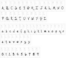
I’m doing some reading and recording this evening, so I thought I’d pass along an excellent link forwarded to me by Mr. Russo re: fonts.
There’s a tab on this site for my handwriting font and a link for its download. It’s also listed on dafont.com, which is mentioned in the article, and countless other websites. At this point, if I had a nickel for every time my font has been downloaded… well, I’d have a new car. Not a lot, but not too shabby, either.
And don’t forget, my handwriting is superior to Barack H. Obama’s.
The article below talks about making one’s own font, and it really is as much of a joy as this article suggests. I made my handwriting font on a night when I had the flu. I wasn’t capable of doing anything more than writing a few letters on paper and clicking a few buttons - and it’s a task that can be interrupted frequently for flu-things - and, voila! A few hours later and I had a handwriting font.
Since then, it’s been used for lots of projects and by lots of different people. Many school yearbooks have found it a nice blend of relaxed, genuine handwriting while still being slightly chic/elegant. It has been featured in yearbooks both near and far, US and international.
It’s also been a favorite of scrapbookers - I assume for the same reasons that K-12 yearbooks have latched onto it.
There are two questions which constantly pop up regarding my handwriting font:
1. Aren’t you worried that someone will steal your identity and write checks using your handwriting?
Nope - because, in truth, my handwriting font is one big lie.
Yes, it’s really my handwriting - that part is genuine. But I never, ever print - ever. I write exclusively in cursive [a hybrid cursive, actually, as you'll see in the Obama link]. If one sees something attributed to me and it’s in print, like this font, then it isn’t mine.
The only time in the last 5 years that I can remember printing was when I made the handwriting font.
2. How can I make my own font?
And here’s where A. Russo’s excellent link comes in. I didn’t use FontStruct, but I love what I see - check out the article below for an introduction.
FontStruct is a free, web-based utility to make your own font. No graphics design knowledge required, no technical knowledge. It’s a WYSIWYG setup - What You See Is What You Get.
Like I said, I used something else. I talked to the designer who I respect the most and asked him if he’d heard of FontStruct. Absolutely, he said, and it was, in his words, “Awesome.” I’ve toyed around with it and I have to agree.
Oddly enough, the forwarded piece is from Slate, which I gave up reading just a few days before this article came out.
“YouType: The Strange Allure of Making Your Own Fonts,” by Jason Fagone.
Posted Friday, June 6, 2008, at 1:30 PM ET
In April, an online
font clearinghouse called FontShop quietly uploaded a program that, the company wrote, was meant to be “purely entertaining—something to kickstart creativity.” FontStruct, a browser tool that lets anyone create an original
font, was so popular that the site’s servers crashed within days of the official launch. As of this writing, 1,509 DIY fonts of all types—pixel fonts optimized for the Web, text fonts for documents, display fonts, “dingbat” fonts—are available for free, making the site an instant Web 2.0 community: the YouTube of typography. Although the term
typography seems a tad grandiose for a site on which one of the most celebrated fonts, Luchador, is a series of pictures of Mexican wrestling masks.
FontStruct’s interface couldn’t be more intuitive. The central metaphor is a sheet of paper. You draw letters on the “sheet” using a set of standard paint tools (pencil, line, box, eraser) and a library of what FontStruct calls “bricks” (squares, circles, half-circles, crescents, triangles, stars). If you keep at it and complete an entire alphabet, FontStruct will package your letters into a TrueType file that you can download and plunk into your PC’s font folder. And if you’re feeling generous, you can tell FontStruct to share your font with everybody else on the Internet under a Creative Commons license. Every font has its own comment page, which tends to fill with praise, practical advice, or just general expressions of devotion to FontStruct. “Hey,” comments one gleeful FontStructer, “all of us are going to be little Adrian Frutiger[s]!”
No disrespect to Adrian Frutiger—who is, of course, the Swiss graphic designer who created the Univers and Frutiger typefaces—but why would anyone want to be a little Frutiger? More broadly, why do people create their own fonts? What’s the payoff?
FontStruct isn’t the only locus of DIY font-making activity on the Internet. DaFont.com includes download links to 8,031 free fonts arranged into 71 categories, including “Curly,” “Celtic,” “Fire/Ice,” “Sexy,” and “Army.” Somebody’s making these things—obsessing over serifs, tweaking stems and spurs, skipping story time with the kids so they can finesse the “ear” on a lowercase G. It’s hard to think of a more frivolous pursuit. I just scrolled through the font list on my iMac, and it took me 10 full seconds. Operating systems these days ship with hundreds of fonts, from American Typewriter to Zapfino. Sure, if you’re a graphic designer, you need extra fonts, custom fonts, the kind that happen to be hawked in a small advertising box to the side of every FontStruct window. (The program’s creators are using the free tool to drive sales of their fancy, nonmodular fonts.) But the vast majority of FontStruct users aren’t professional designers, just enthusiastic font geeks.
I know that because I’m one of them. FontStruct brings back a ton of memories; in college, I used to run my own free-font site called Alphabet Soup, where I uploaded cheapie fonts I made with a pirated version of a $300 program called Fontographer. Even today, when I self-Google, I mostly come up with links to my old, crappy fonts. (My secret fear is that no matter what I do as a reporter, the Monko family of fonts will remain my most durable legacy.)
I was a miniscule part of the great grunge-font craze of the late ’90s, ignited by the bad boy of graphic design, David Carson—an ex-surfer who took over RayGun magazine and turned it into a punk-rock version of Rolling Stone, a bible of the ugly/pretty/ugly aesthetic. Carson’s movement was fueled by hundreds of young dabblers like me. In our dorm rooms, we churned out distressed versions of workaday fonts: smeary Helveticas, grimy Garamonds. The self-seriousness behind it all seems strange when I look back, but it was actually in keeping with the manifesto-laden history of graphic design. One of the most famous designers of all time, Jan Tschichold, famously issued a diktat against the use of serif faces, decreeing that the only honest letterforms were sans-serifs. The Nazis, who preferred “blackletter” fonts with heavy, ominous down strokes—what came to be known as “jackboot grotesques,” according to art historian Stephen Eskilson—put him in prison.
The FontStruct community represents the opposite of all of that. FontStruct is about fun and lighthearted experimentation, the pure joy of making letterforms. If the fonts on the site embrace any aesthetic, it’s the freewheeling kitsch of the early days of desktop publishing, when programs like Adobe PageMaker brought the tools of graphic design to the masses well before the masses knew what to do with them. This led to some heinous crimes against the craft, like annual reports plastered with novelty fonts. You’ll find some of that 1980s exuberance in FontStruct’s offerings, like a font that has hairdos, and a font that looks like a city skyline, and a font that’s a bunch of adorable monkeys. But the program also inspires subtler fits of out-of-the-box image-making. Check out the very sexy Structurosa Script, a font that is “cute but also menacing,” as one commenter accurately observes, and WPA Gothic, modeled on New Deal-era posters and dripping with gravitas and retro cool. My favorite FontStruction is probably SlabStruct Too, a font that’s simultaneously meaty and understated, elegant and crisp. (The best part is that I didn’t have to dig through pages and pages of lesser fonts to find these gems, because FontStruct has a star-based rating system similar to YouTube’s.)
The FontStruct aesthetic is largely a function of the font-making application. Unlike the gold-standard program for making fonts, Fontographer, which can turn any shape into a letter, FontStruct imposes constraints. It doesn’t let you make just any shape; you’re limited to the “bricks” FontStruct provides. Also, your font has to be “modular,” the letters conforming to a standard grid (which precludes overly fancy cursive strokes). FontStruct is the Casiotone keyboard of font-making. Maybe you can use it to bang out a credible pop song. Beethoven? No way.
And yet, as often happens in art, aesthetic limitations breed creativity. The most ambitious FontStruct users have created letterforms so ornate you’d never believe they’re derived from a set of prefab shapes. One particularly heroic FontStruct auteur, Wolfgang Krimmel, who seems to be an actual graphic design pro—a ringer!—has constructed two fonts that resemble the text from illuminated manuscripts. Dabblers like me also benefit from the program’s limitations. As soon as I registered and clicked “Create New FontStruction,” I began to draw short, fat, blocky letters just a few pixels high. Then I realized I could make the letters as high as I wanted, so I used cut-and-paste tools to elongate my A and B and C until they were tall and thin and imposing, like the alien ships in War of the Worlds. Then—I’m a bit embarrassed to admit this—I used one of the program’s many editing shortcuts to make it look as if my letters were composed of five-pointed stars. Just because I could. Serendipity is the whole point. FontStruct forces you to be open-minded, to be kind toward the unexpected forms you stumble into. And because FontStruct lets you preview your letters with one click, you can decide instantly whether to keep your changes or sprint off in a completely new direction.
This instant-gratification quality is the true appeal of FontStruct and of font-making in general. There’s something about that moment when your own letters begin to flash across the screen. Partly, it’s sheer childlike bliss—after all, how many hours do we spend as kids learning how to write in cursive, writing our name over and over, regarding our handwriting, hoping it’s special, stylish, distinguishable from the next kid’s? But it’s also satisfying in a distinctly grown-up way. If you’re reading this, you’re probably like me, and you have a job in which you stare at a screen all day. And it’s not even your screen. It’s somebody else’s pixels and windows and letters. Make a font and you start to screw with the scenery—the banal yet elemental DNA of your daily existence. It’s as if you could design and build your own subway turnstile or change the color of a Starbucks cup from off-white to fuchsia. Here’s a program that lets you commit a small, safe, infinitesimally subversive act and then share it with the world. FontStruct may make it worth aspiring to be a little Frutiger, after all.


